YipitData Investor Portal Homepage Redesign
Type: Product Design
Timeline: 48 hours
Tools: Figma
Scope: Dashboard homepage redesign for an existing B2B investor research platform
The Brief
YipitData provides proprietary data and research to institutional investors. Their portal homepage had accumulated the usual entropy of a mature product — modules added over time, no clear hierarchy, no strong orientation moment when users returned after time away.
The ask: redesign the homepage. No constraints on approach. Show design thinking, not just decoration.
The four goals the new design needed to serve:
Quickly understand what's changed since their last visit
Identify relevant companies, sectors, or trends
Validate or challenge an investment thesis
Move efficiently from insight → deeper analysis → action
The Problem with the Existing Design
The page treated every piece of information as equal weight. New reports, watchlisted companies, upcoming calendar events, trending coverage, all competed for attention with similar visual hierarchy.
An analyst returning after a day away had no clear answer to the most important question: what's new, and does it matter to me?
The deeper issue was structural. The page was a collection of widgets. It wasn't a system with a point of view about what the user should do first.
Design Direction:
Command Center
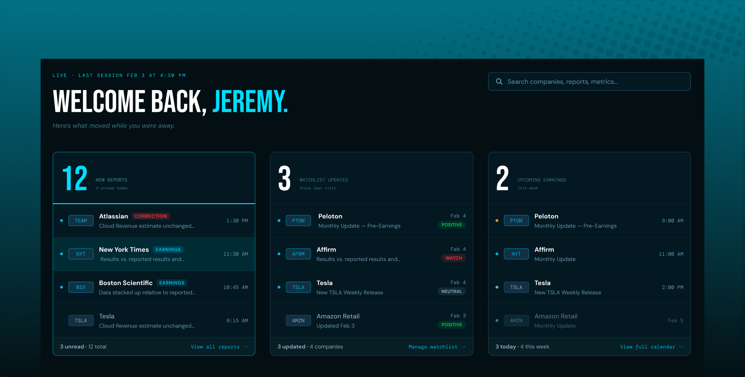
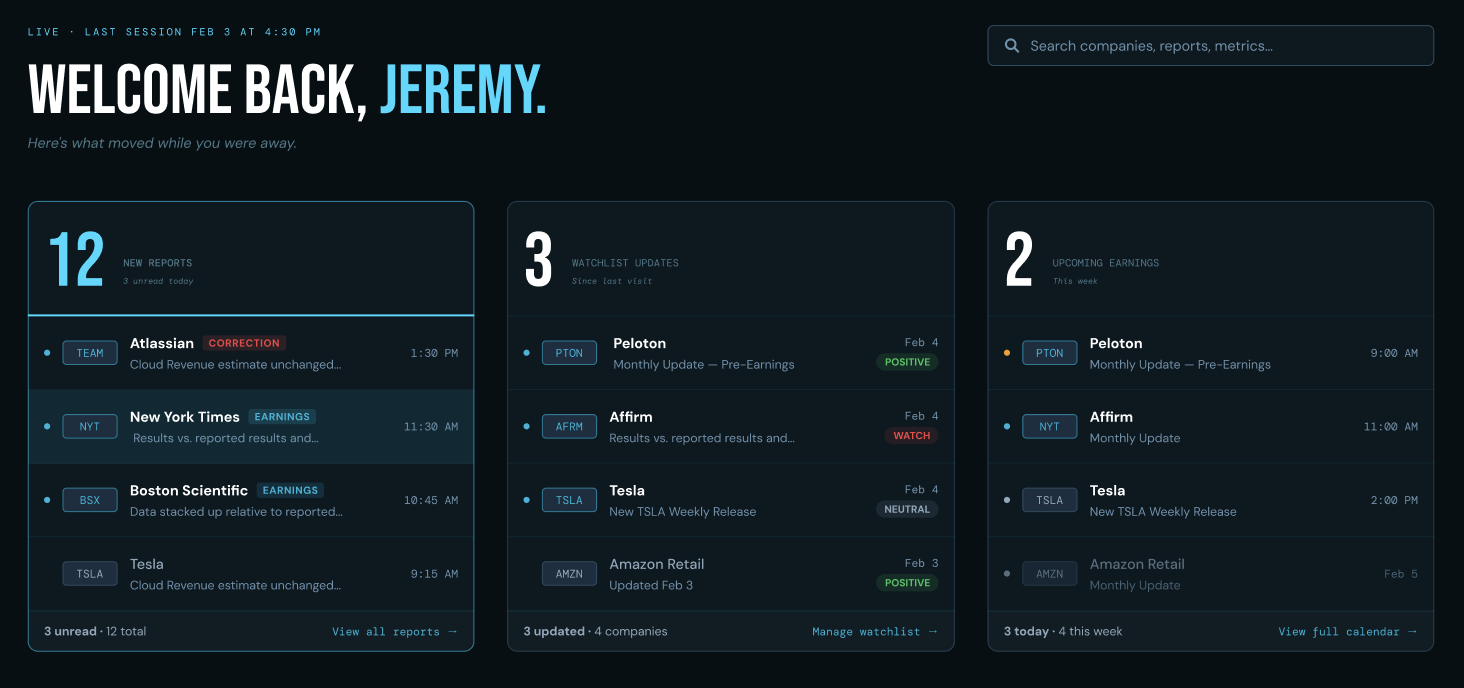
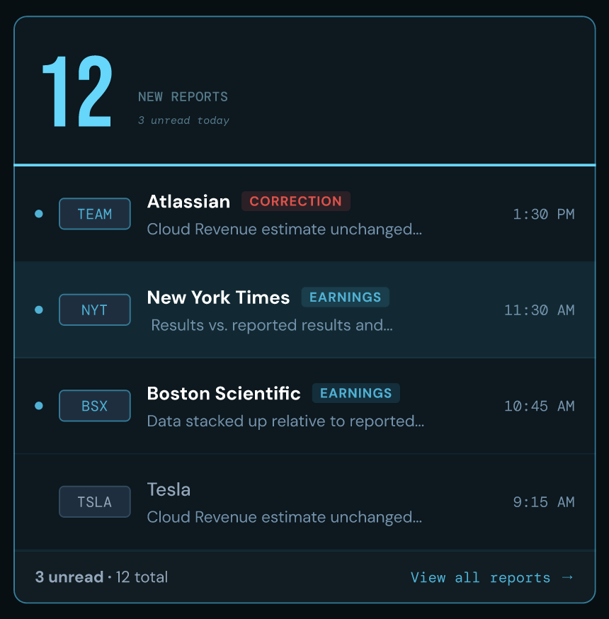
The concept I landed on was a re-orientation experience. Not a dashboard you scan — a briefing you receive. The homepage should answer three things in the first three seconds:
How many new reports since you were last here
Which companies you're watching got updated
What's coming up this week
Everything else — the full feed, trending coverage, deeper tools — is secondary context that supports those three answers.
The three delta numbers became the focal point of the page. Not buried in a strip or treated as metadata but displayed at 72px, above the fold, with the actual content previewed directly beneath each number. You see 12 and immediately below it are the 12 reports, ranked by recency. You don't have to click to find out what 12 means.
Layout Decisions
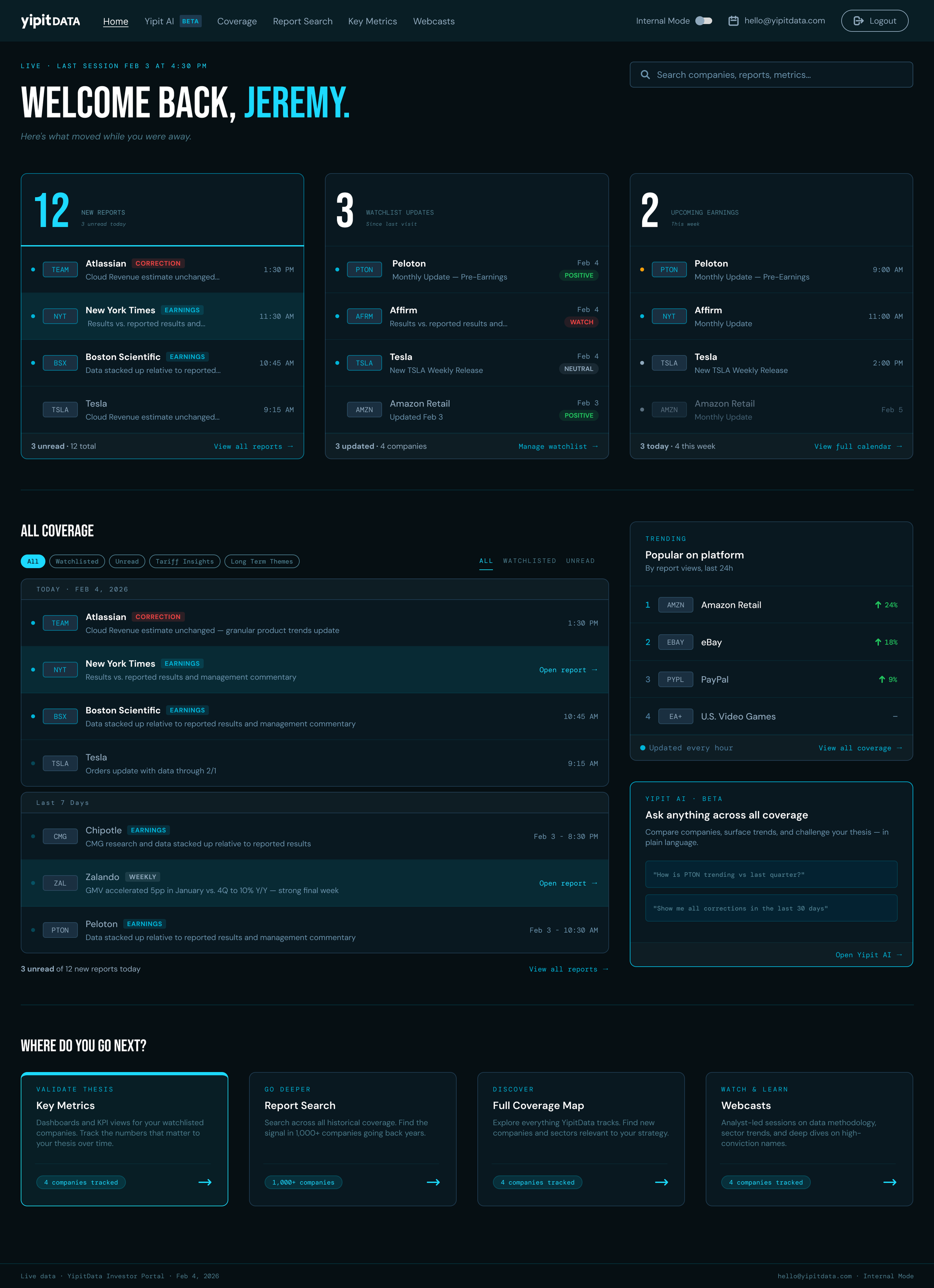
The page scrolls naturally. An early version locked everything into a fixed viewport. It felt efficient but actually compressed too many competing elements into a space that didn't breathe. The final design lets the hero own the full above-the-fold experience, then reveals the deeper feed and context below.
Full-width hero. The welcome moment is generous: the user's name at display size, the live timestamp, the three numbers. This is the "you're back" moment and it earns its space.
Two-column body. The report feed takes the left column, updating the analyst on everything in the coverage universe. The right sidebar holds Trending and the Yipit AI CTA which represent contextual tools that stay accessible without competing for primary attention.
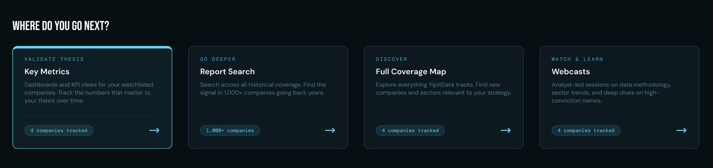
Downstream section at the bottom. One of the clearest UX gaps in the original was that the homepage was a dead end. You read it, then went somewhere else by instinct. The redesign closes the loop explicitly with a full-width section labeled "Where do you go next?" including four cards mapped directly to the four user goals: validate thesis → Key Metrics, go deeper → Report Search, discover → Full Coverage Map, take action → Webcasts.
Hierarchy in Practice
Every row on the page is a door, not a display.
On hover, report rows replace the timestamp with "Open report →".
Watchlist rows replace the signal pill with "View key metrics →".
The affordance appears at the moment of intent, when the user's cursor moves toward something, rather than cluttering the resting state.
The unread state system uses a consistent set of signals across every component: a teal left border on rows, teal ticker badges, white company names instead of muted. Read vs. unread is scannable in under a second.
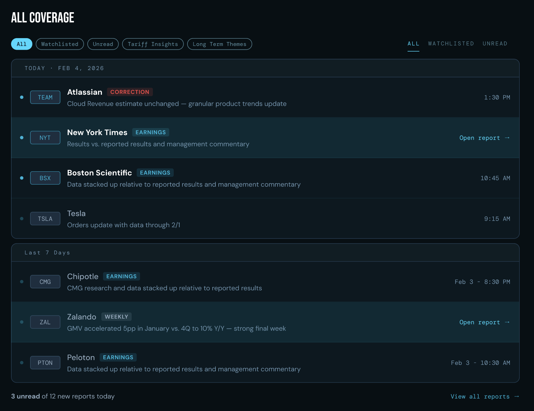
Visual System
The palette is rooted in a deep navy-teal — dark enough to feel premium and focused, with teal as the single accent that carries all active and interactive meaning. Using one accent color for everything active means the eye learns fast: teal = something you can do or something that's new.
Three typefaces, each doing a specific job:
Bebas Neue — numbers, headings, section titles. Authority and weight.
JetBrains Mono — labels, timestamps, tags, metadata. Data register.
Instrument Sans — body copy, descriptions, company names. Readable and human.
The type system creates a clear reading hierarchy across the page without needing heavy use of size alone.
What I'd Explore Next
This is a homepage. The system implied by the design suggests a few natural next screens:
Report detail page — the destination of every "Open report →" interaction. Given the data-dense nature of YipitData's output, the key challenge would be surfacing the verdict (positive/neutral/watch signal) and key metrics before the full report body.
Key Metrics dashboard — the primary thesis-validation tool. Each watchlisted company should have a comparable KPI view so analysts can track their thesis over time, not just read the latest report.
Yipit AI — the most interesting UX challenge. The prompt chip pattern on the homepage suggests a query interface, but the real value is contextual: surfacing AI capabilities at the moment a user is already looking at something relevant, not as a separate destination.
YipitData is a real company. This redesign was created as a design exercise and is not affiliated with or endorsed by YipitData.