Design Systems Mastery: Building Meridian DS
Role: Lead Product Designer
Scope: Token architecture, component design, documentation, interaction design
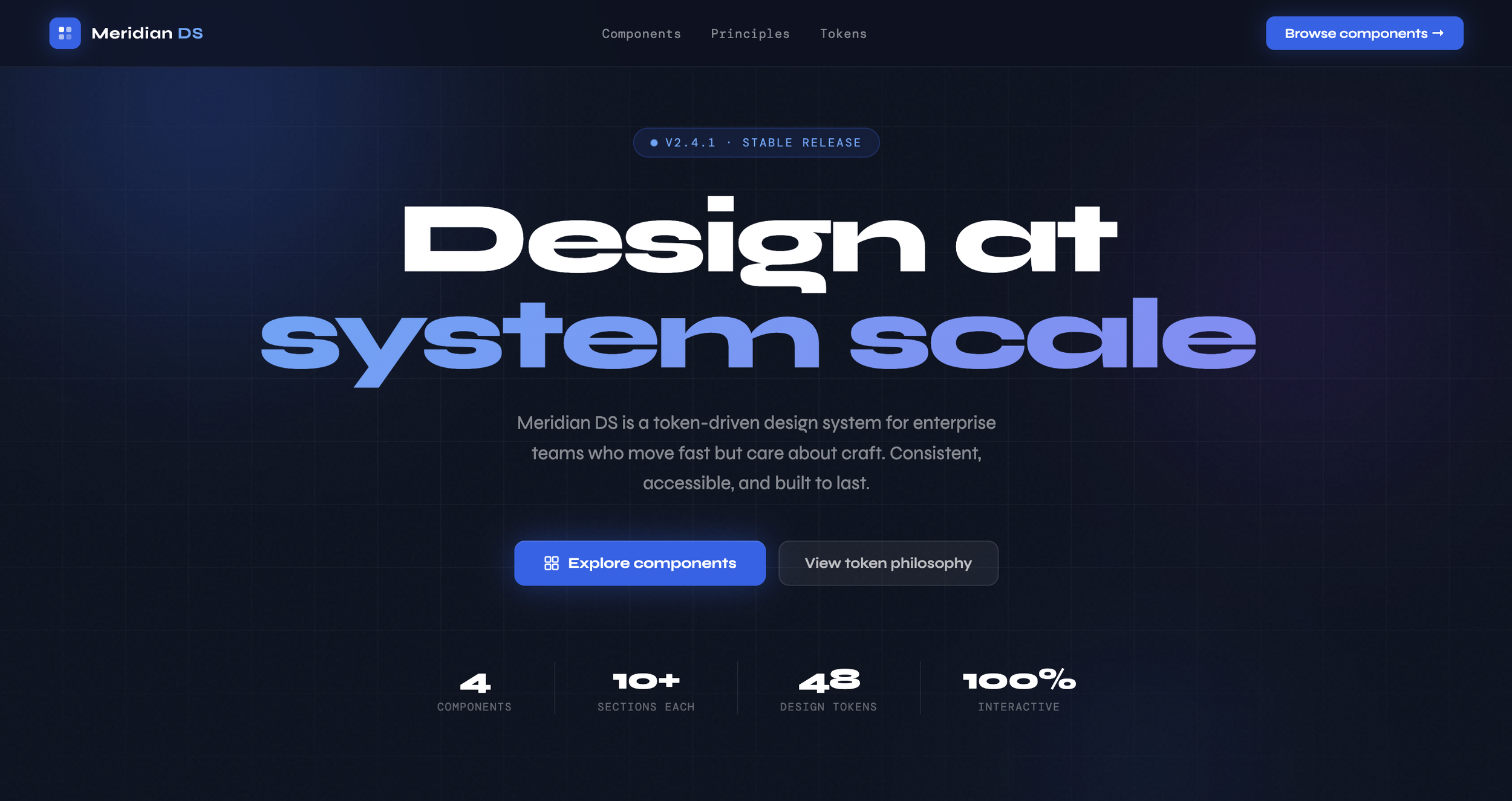
Status: In progress — 4 components documented, expanding toward white-label product
Most design systems fail quietly. They launch with a Figma library and a Slack announcement, and within six months they're out of sync, partially adopted, and quietly resented. Designers work around them. Engineers ignore them.
At Meta Reality Labs, I worked inside one of the most mature design systems in the industry. Even there, the hardest problems weren't visual. Who owns this component? What's the source of truth when Figma and code diverge? How do you push a breaking change to 40 product teams at once?
A design system is an infrastructure problem wearing a design costume. Meridian DS is my answer to: if I were starting one from scratch, knowing what I know now, what would I build?
The Problem with Most Design Systems
Principle 01
Tokens Before Components
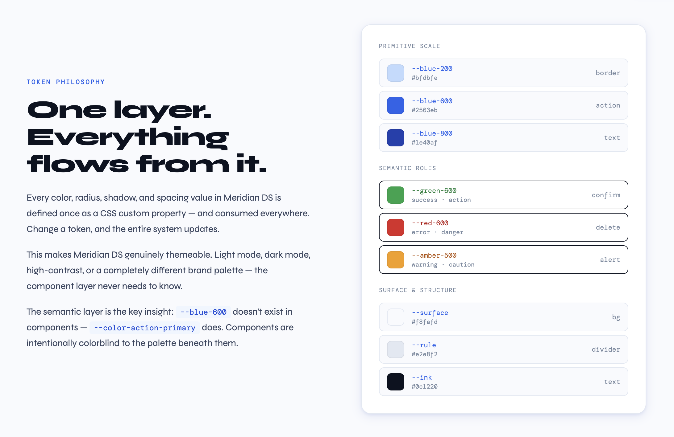
Before I design a single component, I design the token layer. Not because it's best practice. Because I learned what happens when you skip it.
At Mole Street, we were three weeks from launch when a client changed their primary blue. Six shade variants, used in 47 components, spread across Figma, Webflow, and a HubSpot theme. Without a token layer, that was a multi-day find-and-replace. With tokens, it's one variable.
In Meridian DS, every color, radius, shadow, and spacing value is a named CSS custom property before it touches a component. A button doesn't know it's blue, it knows it's the primary action color. The token table in every component page isn't decorative. It's a contract between design and implementation.
Principle 02
Every State Is a Design Decision
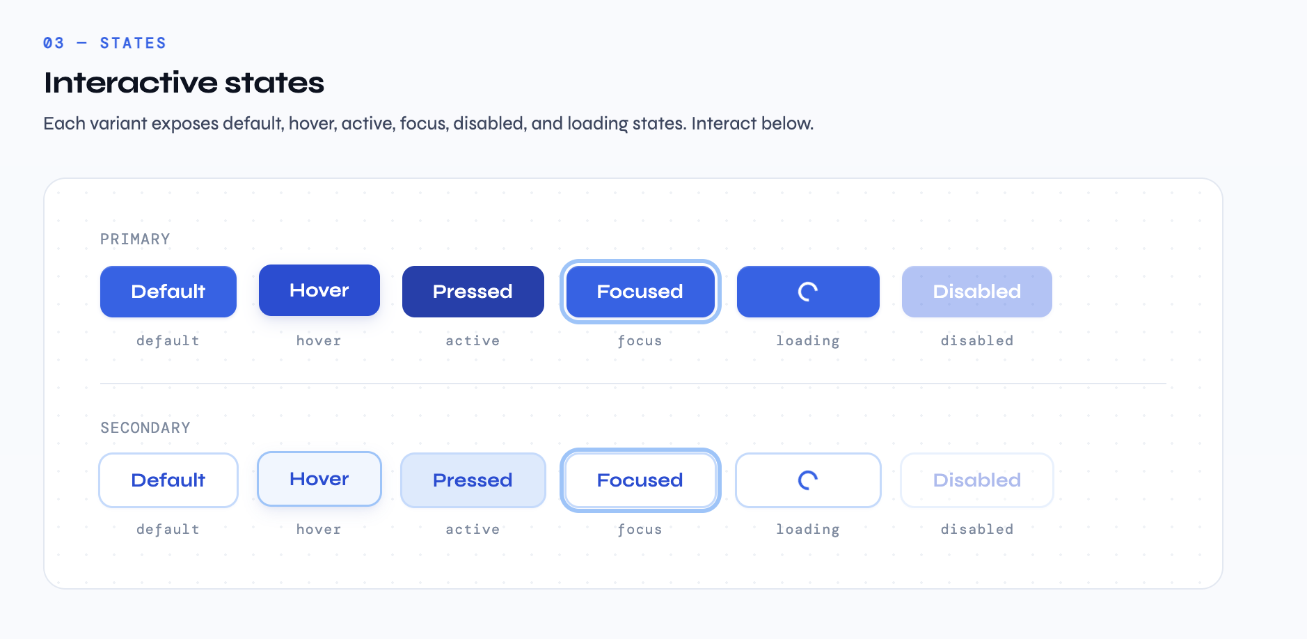
There's a version of component design that stops at the happy path. You ship it. Two months later a developer asks what the loading state looks like and you say "use your judgment." That's not a system. That's a suggestion.
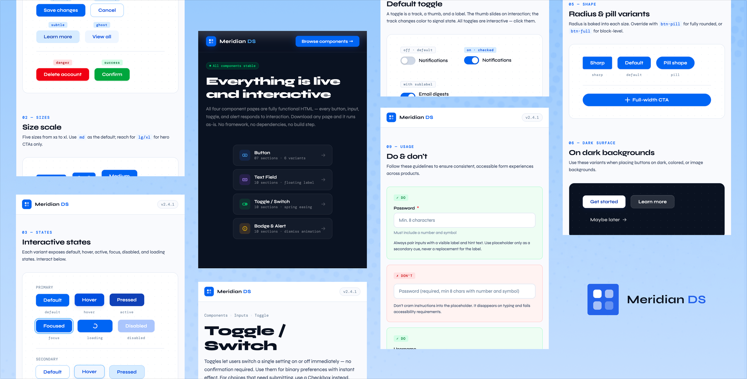
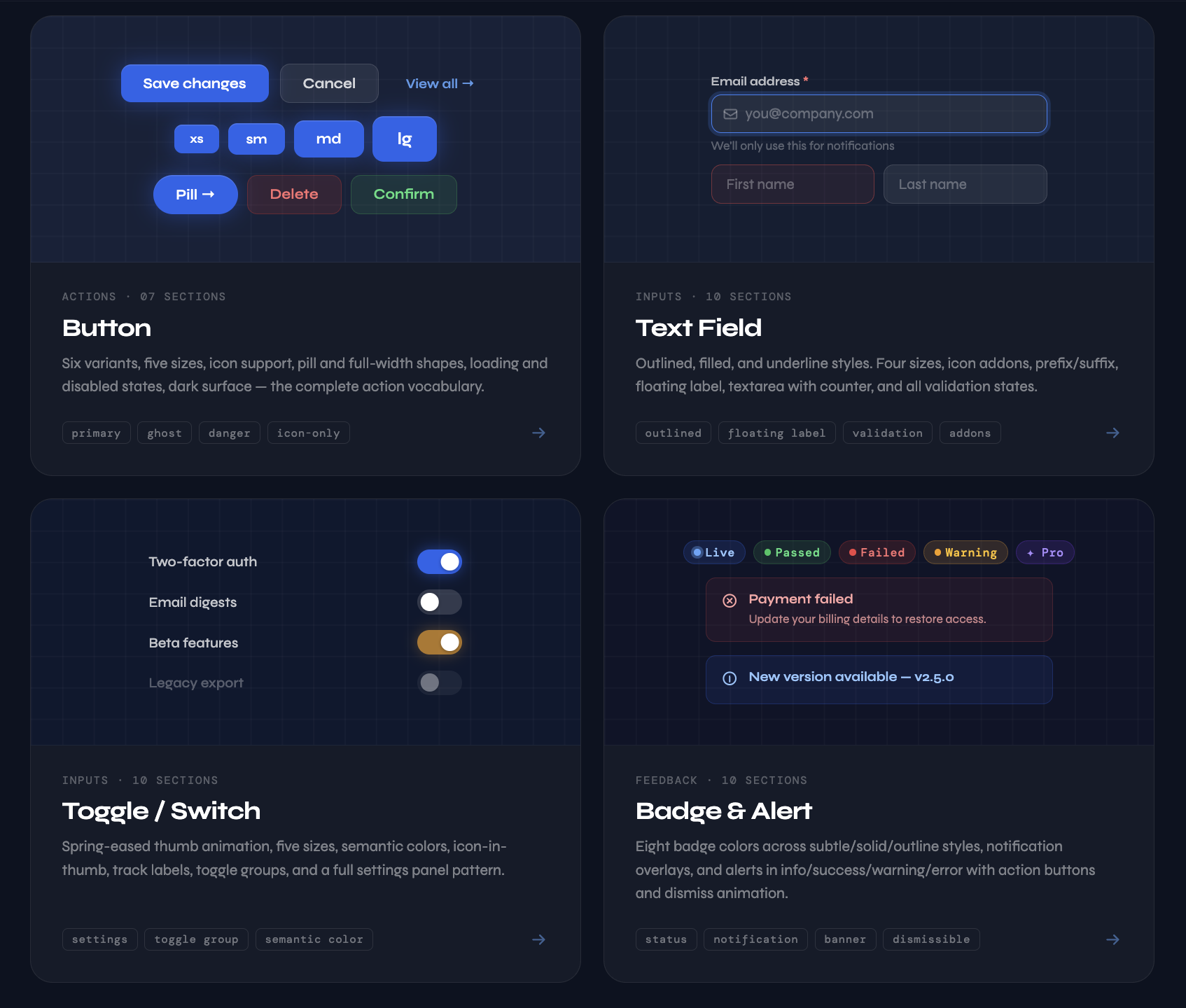
In Meridian DS, every component documents every reachable state. For Button that means default, hover, active, focus, loading, and disabled — across six variants and five sizes.
This came directly from Meta. On an e-commerce checkout redesign that drove a 5.4% conversion lift, meaningful gains came from states we'd left undefined: the loading state between payment initiation and confirmation, the error recovery when a card declined, the disabled state on submit during processing. On high-traffic commerce surfaces, those are where users make trust decisions.
Principle 03
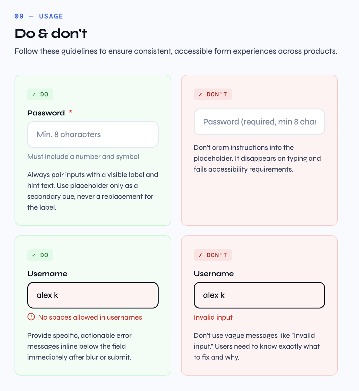
Documentation Is the System
A component without documentation is just a widget. What separates a design system from a component library is the layer of intent above the code. Why does this exist? When should you reach for something else?
Every Meridian DS component page ends with a Do / Don't section — not as a checklist, but as an argument. The Text Field page argues that placeholder text is not a label replacement. The Alert page argues that stacking success alerts is wrong and Toast is the right tool for transient feedback.
At Impulse Creative and New Breed, documentation gaps created real product inconsistency — different teams making different calls on the same component. Writing the usage section is not optional polish. It's the job.
Principle 04
Interaction Is Part of the Spec
Static specs lie. A comp showing a toggle on and off doesn't tell you how it moves. A token table doesn't tell you that spring easing makes a thumb feel like it snaps rather than slides.
In Meridian DS, every component runs in a browser. The toggle uses a cubic-bezier spring that slightly overshoots. The alert dismissal animates height, opacity, and position simultaneously so the space collapses cleanly. The password reveal actually toggles the input type.
These are design decisions expressed in the only medium that's honest about what's happening. When a PM asks how something feels, the answer should be: open this page and click it.
Principle 05
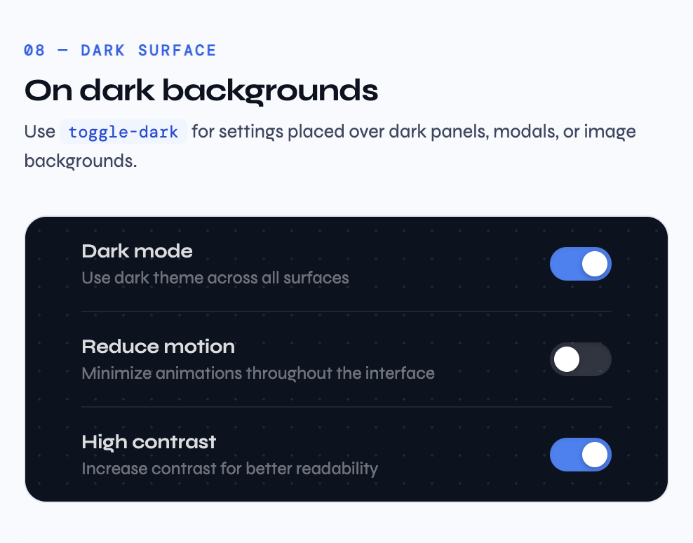
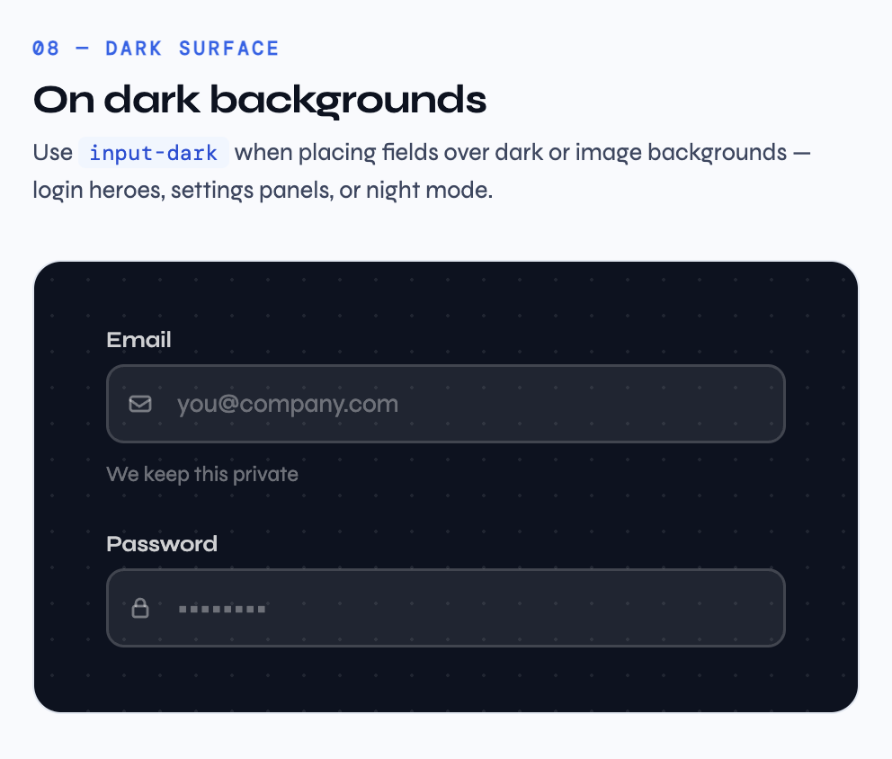
Dark Is a Separate Design Problem
Dark mode is not an inversion filter. Shadows become glows. Tints go muddy. Borders that read against white disappear against dark at the same opacity.
In Meridian DS, dark surface variants are designed separately, not derived. Values are chosen by eye for the specific visual weight they need on that background, not calculated from a rule.
B2B SaaS users increasingly live in dark environments — IDEs, terminals, operator dashboards. A system that treats dark as second-class produces interfaces that feel like they don't belong there.
Principle 06
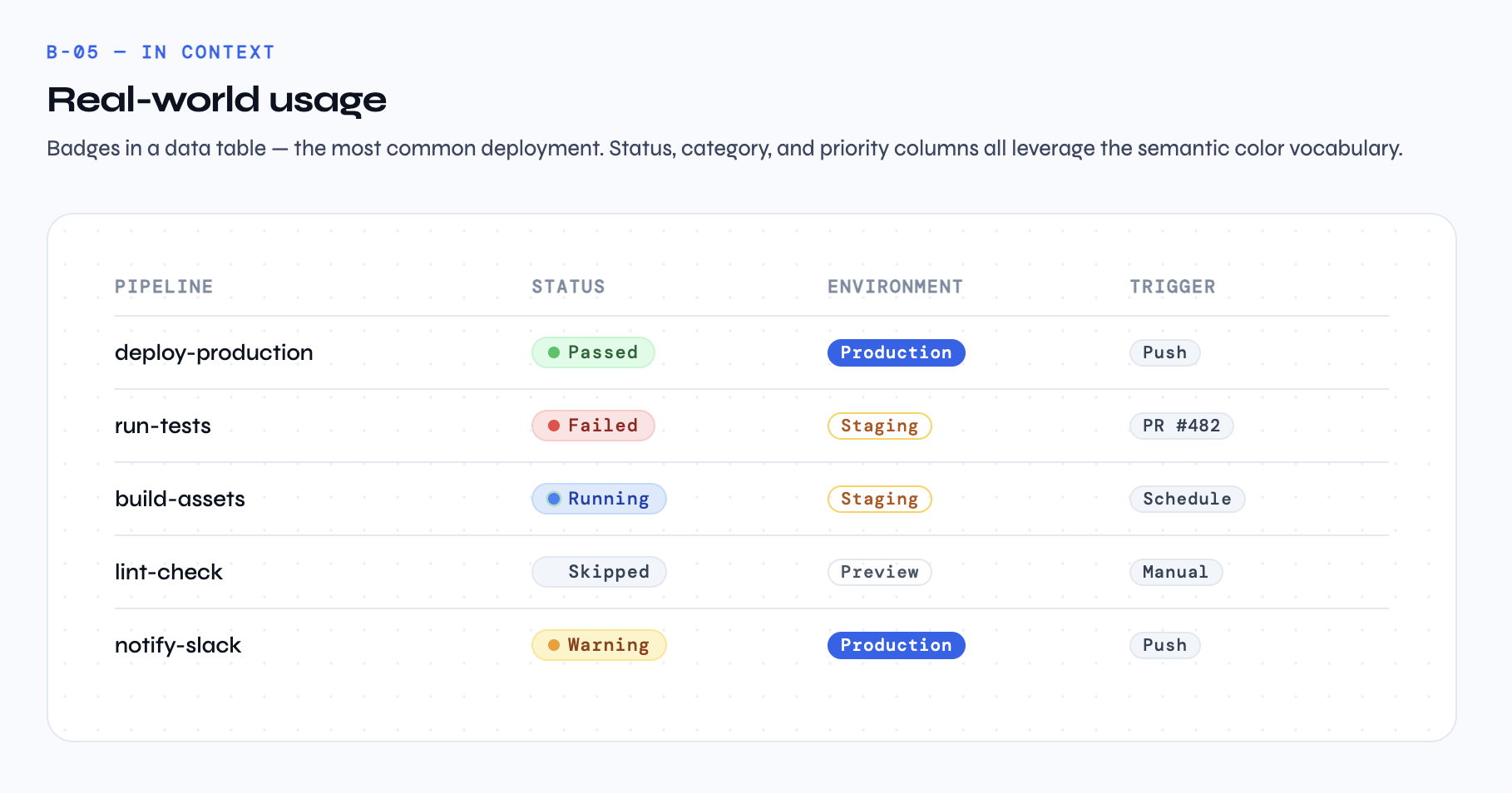
Patterns Close the Gap
A button page shows a button. In a real product, that button sits inside a form, next to a text field, above an alert. The component in isolation and the component in composition are different design problems.
Every Meridian DS component page includes a real-world pattern section. The Toggle page's Settings Panel looks like an actual product screen. The Badge page's pipeline table looks like a CI/CD dashboard. The Alert page's inline variants show feedback living inside forms, not floating above them.
After twelve years across agency and in-house roles — Impulse Creative, New Breed, Meta Reality Labs — the pattern I keep seeing is that the best systems designers have internalized the product. They know that "status" is a design vocabulary problem before it's an implementation problem.
What's Next
Meridian DS is deliberately incomplete. The current four components cover the foundational action and feedback vocabulary. On the roadmap: Select & Dropdown, Checkbox & Radio, Data Table, and a Color & Typography Foundations page.
The longer-term goal is HubSpot Marketplace submission — where the system gets tested against real client briefs and real edge cases. That's where design systems either hold up or fall apart.
A Note on the Work
Design systems work is thankless in a specific way. You spend most of your time making decisions nobody will notice if you get right. The focus ring offset. The easing curve. The exact wording of a usage note. The reward is the absence of problems downstream.
But it's the highest-leverage design work I know. A single well-documented component might inform hundreds of product decisions over its lifetime. A badly documented one creates small inconsistencies that accumulate into a product that feels subtly wrong, even when users can't say why.