Laser Grading Visual Identity
A comprehensive brand identity that repositioned a legacy construction company through strategic visual design
Project Overview
A complete brand identity system for Laser Grading & Environmental during a critical ownership transition. The rebrand encompassed strategic brand positioning, visual identity design, brand guidelines, stationery system, and digital presence transforming how the company communicates with both prospective clients and long-standing partners.
The challenge was twofold: attract new commercial opportunities while reinforcing trust with existing relationships. Through thoughtful brand strategy and cohesive visual design, I created an identity that honors the company's 25-year legacy while signaling growth and modernization.
Brand Design Process
Strategic Foundation
Before touching design tools, we conducted stakeholder interviews and competitive analysis within the Southwest Florida construction market. This research revealed an opportunity to differentiate Laser Grading through precision and reliability—qualities inherent to their laser-guided grading technology but underrepresented in their previous branding.
Visual Identity Development
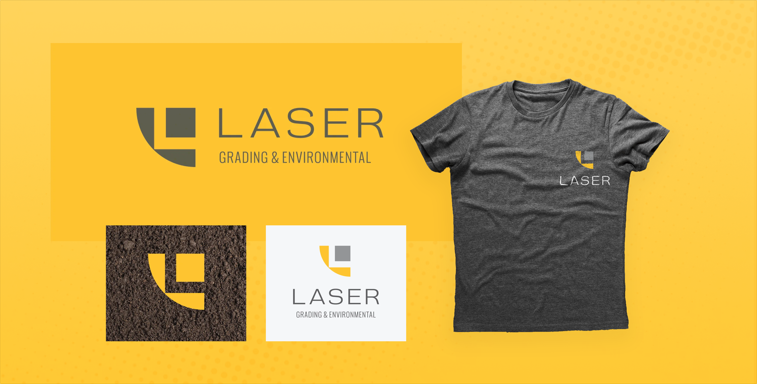
The logomark evolved through extensive exploration of form, negative space, and symbolism. Early sketches investigated ways to reference both the "Laser" name and the heavy machinery central to site preparation work. I explored letterform integration, geometric abstraction, and various expressions of the "L" initial—testing how typography could carry meaning beyond simple identification.
The breakthrough came when geometric abstraction met functional storytelling: the final icon depicts a grading blade and earthwork block, with the negative space forming an implied "L." This dual-meaning approach creates brand recall while subtly communicating expertise in land preparation. The curved blade element adds movement and dynamism to an otherwise industrial mark.
Color Strategy & Visual Language
The brand palette balances industrial confidence with approachability.
Safety yellow (PMS 123) references high-visibility construction equipment and conveys energy and precision, while charcoal gray (PMS Cool Gray 11) grounds the identity with professional authority.
This pairing creates strong contrast for visibility on everything from job site signage to digital applications.
The typography system pairs a clean, modern sans-serif for the wordmark with a condensed sans for body copy, ensuring legibility across applications from vehicle wraps to mobile-responsive web design.
Brand Applications
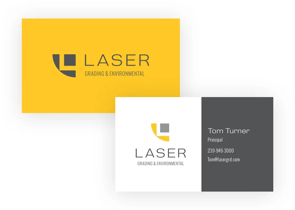
The identity system was applied across essential business touchpoints. The stationery suite demonstrates how the brand scales from large-format (full-bleed yellow business card backs for maximum impact) to professional restraint (white front with strategic color use). The two-sided business card approach creates memorability—the bold yellow back stands out in a wallet, while the front maintains professional credibility.
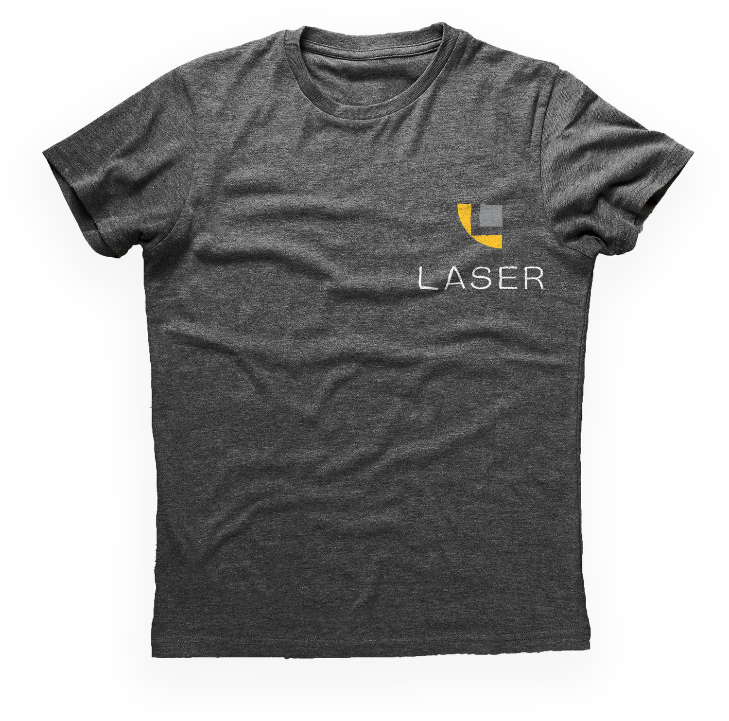
Workwear application shows how the brand functions at small scale. The left-chest placement and simplified lockup maintain legibility even when embroidered, while the charcoal shirt color references the brand's industrial context. This demonstrates the brand's versatility—working equally well on high-visibility marketing materials and practical job site applications.
Additional applications included:
Vehicle wraps and equipment decals
Estimate and invoice templates
Website design with custom iconography
Job site signage and safety materials
Email signatures and digital letterhead
Design Impact
This project exemplifies my approach to brand design: starting with strategic positioning, translating that strategy into distinctive visual language, and building flexible systems that work across all brand touchpoints. The Laser Grading identity doesn't just look cohesive—it actively communicates the company's expertise, precision, and professionalism at every interaction.
The rebrand successfully supported both business objectives: attracting new commercial clients through modernized professionalism while reassuring existing partners that the company's quality standards remained intact through the ownership transition.
About the Client
Based in Southwest Florida, Laser Grading & Environmental has provided residential and commercial builders with construction site preparation and maintenance for over 25 years.