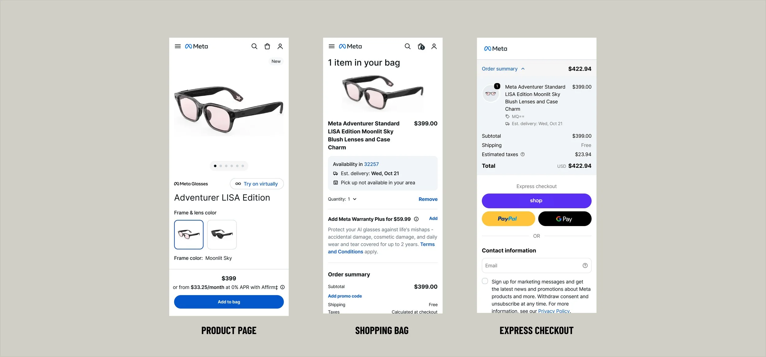
Meta.com Checkout Redesign Case Study
As Senior Product Designer on a cross-functional team at a major social media technology company, I contributed to a comprehensive redesign of our e-commerce checkout experience. This project aimed to increase conversion rates, modernize the interface, and enable global expansion across multiple markets.
Challenges
Our existing checkout flow suffered from several critical issues:
High cart abandonment, particularly on mobile devices and for high-value products
Outdated UI patterns inconsistent with the company's established design system
Limited payment flexibility restricting our ability to serve diverse user preferences
Technical constraints blocking international growth and causing performance issues
Reliability problems including validation errors that eroded user trust
Goals
Increase Conversion; Reduce cart abandonment and friction, particularly for mobile users purchasing high-value products
Modernize Experience; Align checkout with the company's design system to improve consistency, accessibility, and cross-device responsiveness
Payment Flexibility; Integrate modern payment methods (Apple Pay, PayPal, Buy Now Pay Later solutions)
Global Scalability; Build modular checkout architecture supporting region-specific requirements
Technical Performance; Eliminate validation issues and performance bottlenecks impacting trust and completion
Process & Contributions
Working alongside Product, Engineering, and cross-functional partners, I helped translate checkout friction into design improvements, experiments, and scalable solutions.
Discovery & Strategy
I analyzed conversion data and mapped mobile checkout drop-offs, combining behavioral insights with competitive research across six leading e-commerce platforms. I also facilitated stakeholder workshops to align priorities and define success metrics.
Design & Prototyping
I designed responsive checkout flows across shopping bag, upsell, and confirmation experiences, using Meta's established design system to explore solutions and accelerate prototyping. My work included interaction patterns, validation states, and responsive specifications.
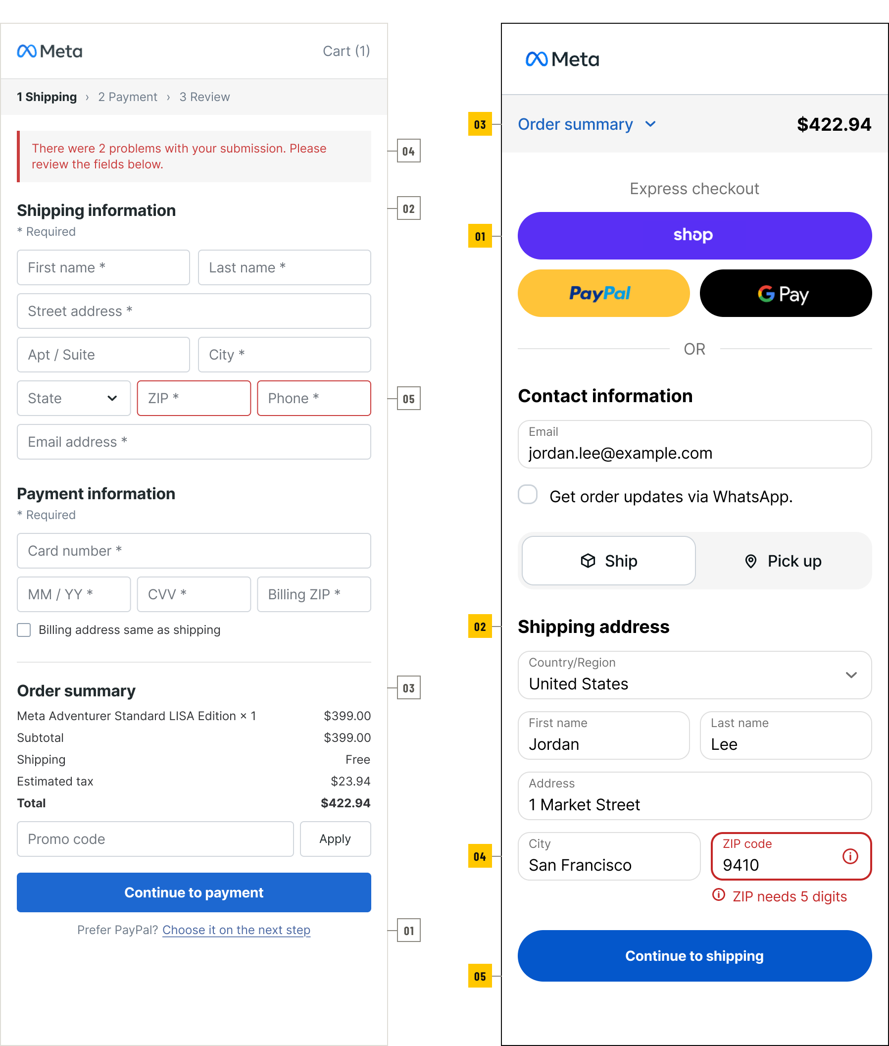
Five targeted changes
Express payment visibility
Wallets moved above the form, so returning buyers can pay before typing anything.Form Hierarchy
Fields grouped by task, with labels that stay visible once a value is entered.Order summary clarity
The total stays in a collapsible header instead of trailing the payment form.Contextual error handling
Errors appear beside the field, in plain language, not in a banner after submit.Mobile usability
One or two fields per row at 49px; express and primary actions at 48–52px.
Validation & Iteration
I designed and evaluated experiments, including Apple Pay Express Checkout, and established internal feedback loops through dogfooding and weekly cross-functional reviews. Testing insights and conversion data informed ongoing refinements.
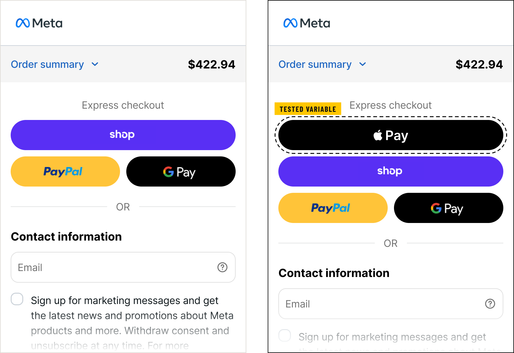
Apple Pay placed above the existing express options.
Implementation & Launch
I partnered with Engineering on feasibility, sprint planning, and QA, documenting interaction states and edge cases to support implementation. Standardizing Figma assets and handoff documentation helped reduce design-to-development handoff time by 30%.
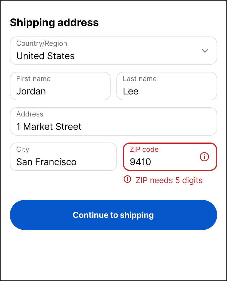
Correct in place
The message sits on the one field at fault; every other value stays as entered.
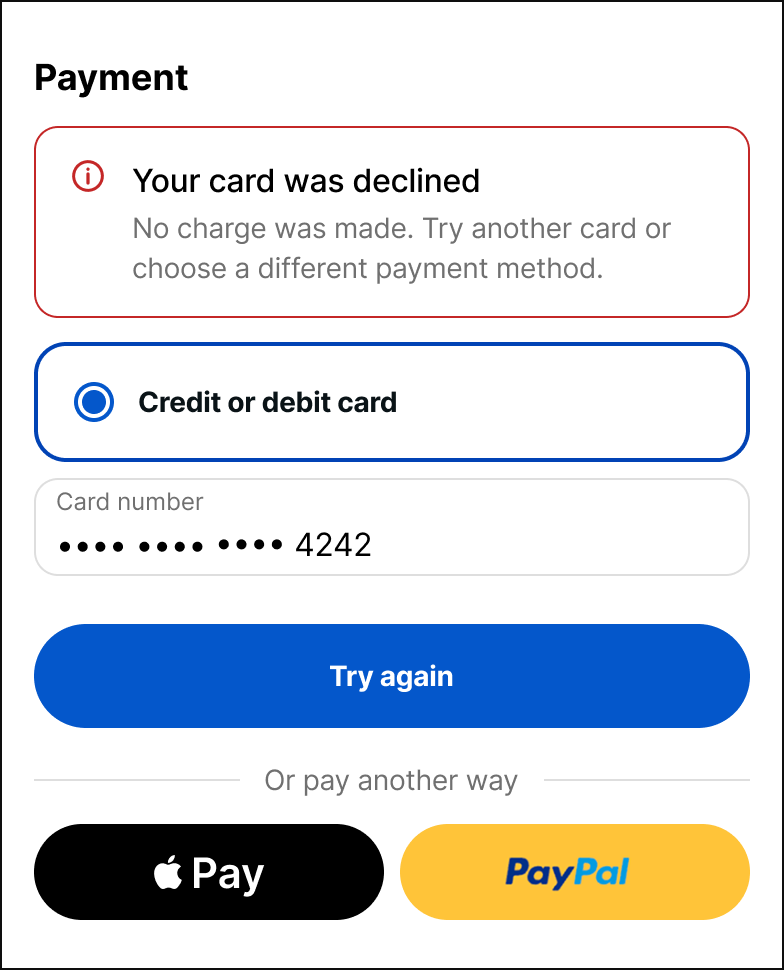
Retry or switch
One explanation, two ways forward: retry the card or move to another method.
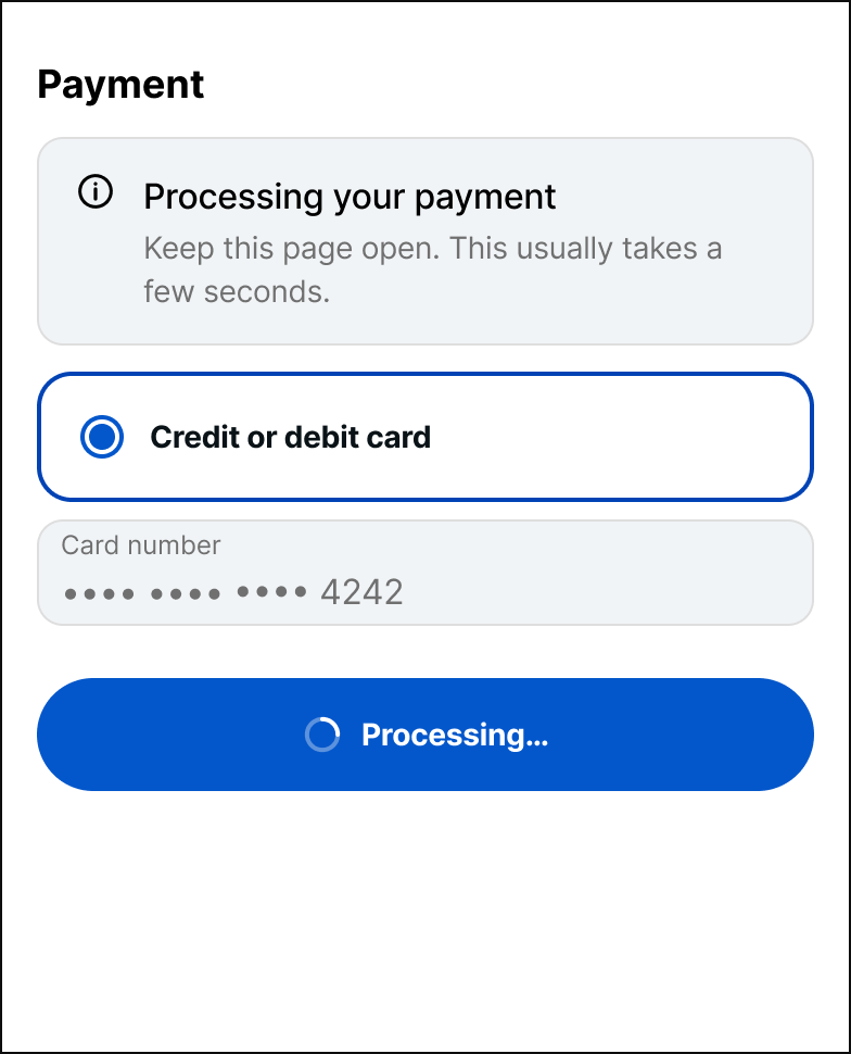
Locks on first tap
Submit and payment fields lock until a response, so a second tap cannot send a second charge.
Results
+5.4% purchase rate: Initial lift from Apple Pay Express Checkout within the first 24 hours.
50%+ faster checkout: Reduced latency by addressing technical bottlenecks.
4 new international markets: Supported expansion into the UAE, India, Canada, and EU through modular checkout architecture.
4 additional payment methods: Expanded flexibility with Apple Pay, PayPal, BNPL, and a company-branded payment solution.
15+ consistent checkout screens: Extended existing design system patterns across the experience.
Results reflect the collective work of the cross-functional team.